SharePoint list formatting made easy
Modern SharePoint list formatting
This article shall give you guidance and inspiration on how to turn your classic boring lists into interactive modern list experiences, which will wow your users, let them get information at first sight, and increase overall productivity. This post is not about the Microsoft 365 list templates; I will cover them in one of the next blog posts.
If you never heard anything about modern SharePoint list formatting, don’t worry; I will guide you through this.
Why would we use SharePoint lists
First things first: Why should we use SharePoint lists and not use - for instance - an Excel spreadsheet? Because we don’t need to hide information in cascading folders, that should be at the user’s fingertips. The beauty of lists lies in their simplicity and flexibility to organize work and track the information that matters most to our businesses.
Creating, sharing, and tracking lists is easy and available on any device; everyone stays in the loop, and we can use lists for all kinds of purposes like tracking issues, assets, routines, contacts, inventory, and more. Lists can easily be customized to make them visually more appealing.
How can we turn on modern experience
Now that we are teased into modern lists and libraries in SharePoint, it’s time to turn on modern experiences. We can do it like this in the classic experience:
- select Library Settings or List Settings on the ribbon
- select Advanced settings and select List experience
- select New experience
- save with Ok
How can we change the look and feel of a list in the UI
Lists can contain different columns, and each column has a certain column type, depending on the kind of value we want to store in that column like text, numbers, dates, choice, persons, locations, links, or images. As lists can contain much information, its brilliant if we emphasize crucial parts by formatting them in a way that they are
- easier to read
- give a grasp on what is going on
- are mobile-friendly
Already built-in, we will find options to format columns and views. Formatting a view means modifying the way the entire list is displayed. Formatting a column means changing the way this particular column looks like.
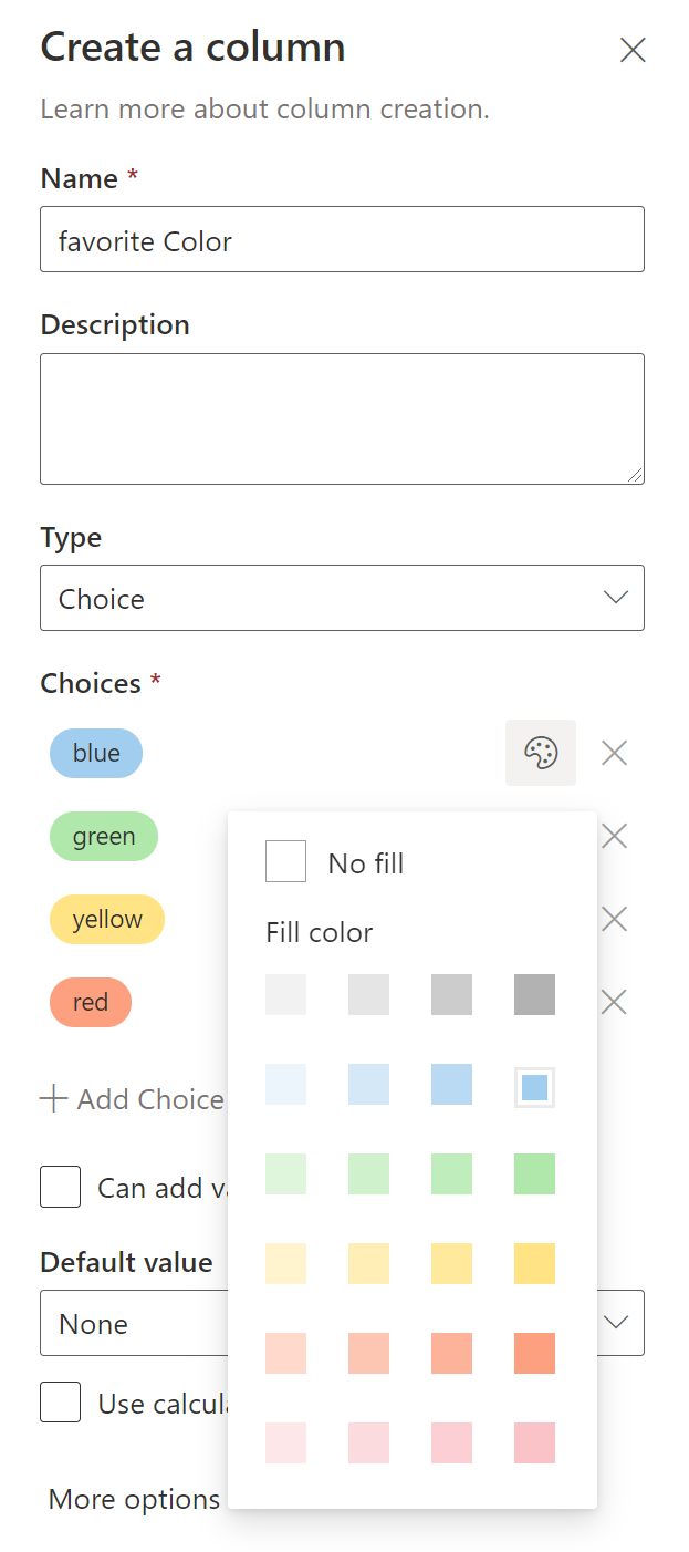
Formatting Views
- We can change the format view
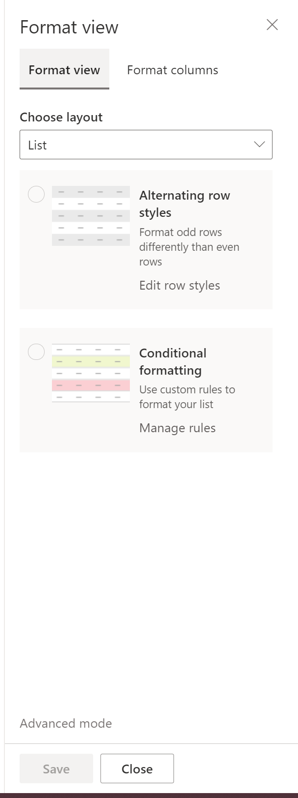
- and also display a gallery view
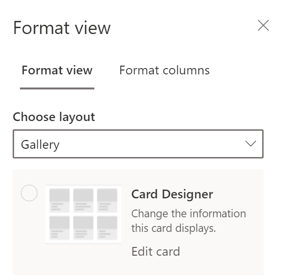
Formatting columns
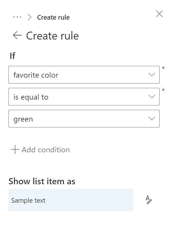
- If we want to change the column’s appearance, we can do that very end-user-friendly directly in the UI:
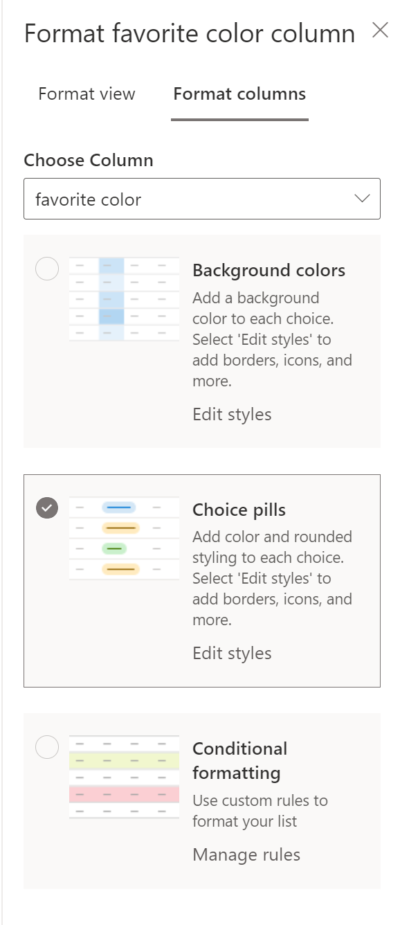 * and even with rules like if - then - else:
How can I apply conditional formatting, aka rules
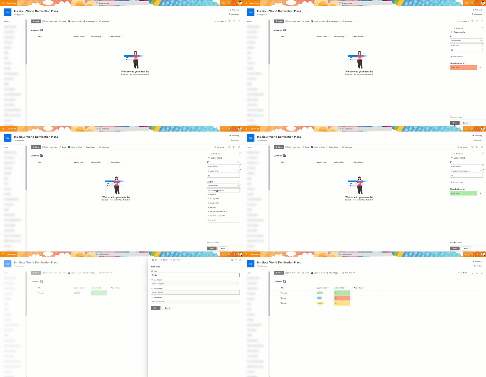
Rules are a powerful feature to determine how a column should look like. Let’s say we want to apply a background color depending on a number value. If the number is below 30, the field should be red; between 30 and 70, it should yellow, and above 70, it should be green. Let’s see how this looks like:
How can we change the look and feel of a list with JSON
Sometimes, even if those options are already cool, we need some more flexibility.

There is a way to format both columns and views beyond what is already offered, as seen above. Perhaps you might have noticed the little link Advanced mode? This is where we will find the cool tools to play with!
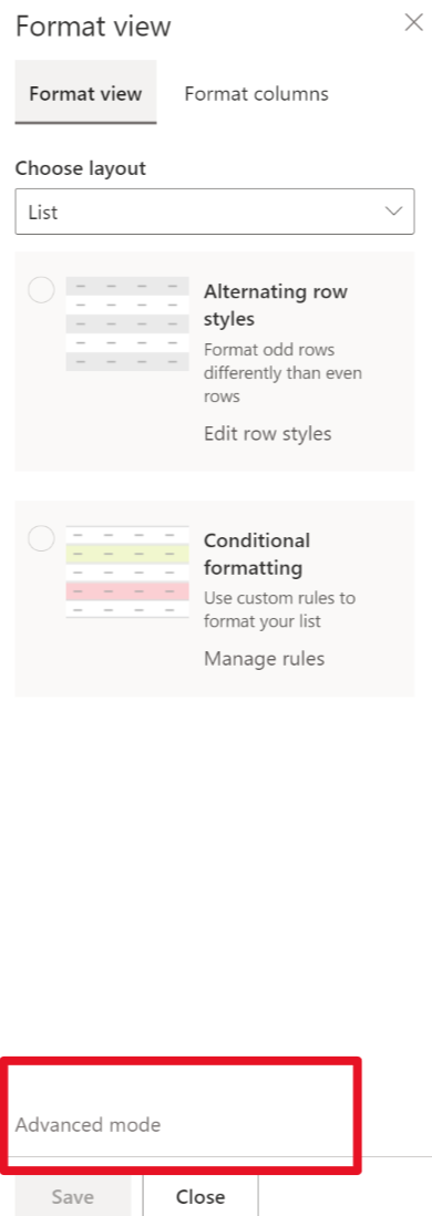
This field expects you to put some JSON code in it to format this column. If you never heard about JSON, you can quickly get started with Intro to JSON by Bob German, this video, or you can learn more at w3schools.
Samples
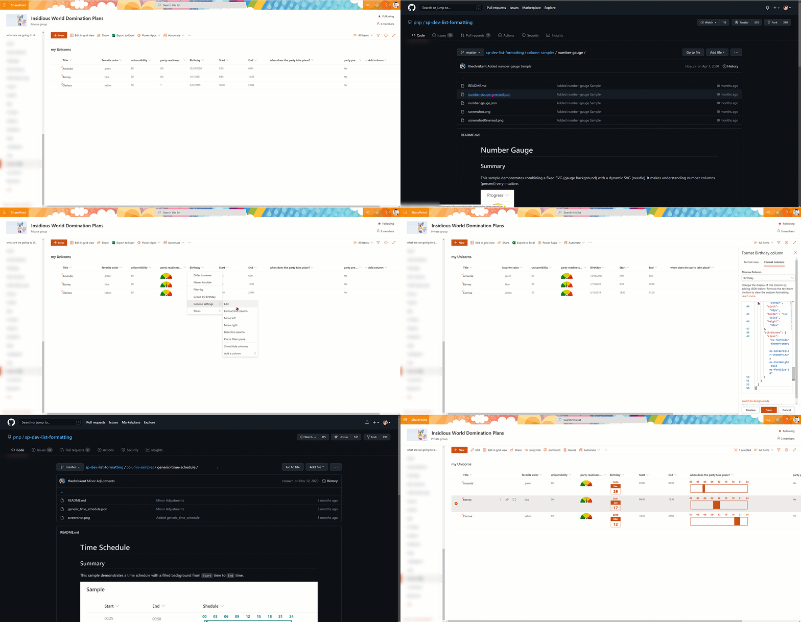
We will browse to the Microsoft 365 PnP List formatting repository on GitHub and open the folder column samples. In here, we will find free-to-use samples to make our lists look fantastic.
Instead of having a list like this:

we can now look at a list like that:

How can we apply a sample?
- Get familiar with the samples that are available on GitHub
- regularly check for new ones / pin the repo
- select the one that is interesting for you
- read the
readme.mdfile to know the requirements for your column. Some samples only work with choice, text, or number columns - open the JSON file
- copy the code to your clipboard
- go to your SharePoint list
- go to column settings –> format this column
- click on Advanced mode
- paste the code
- click Save
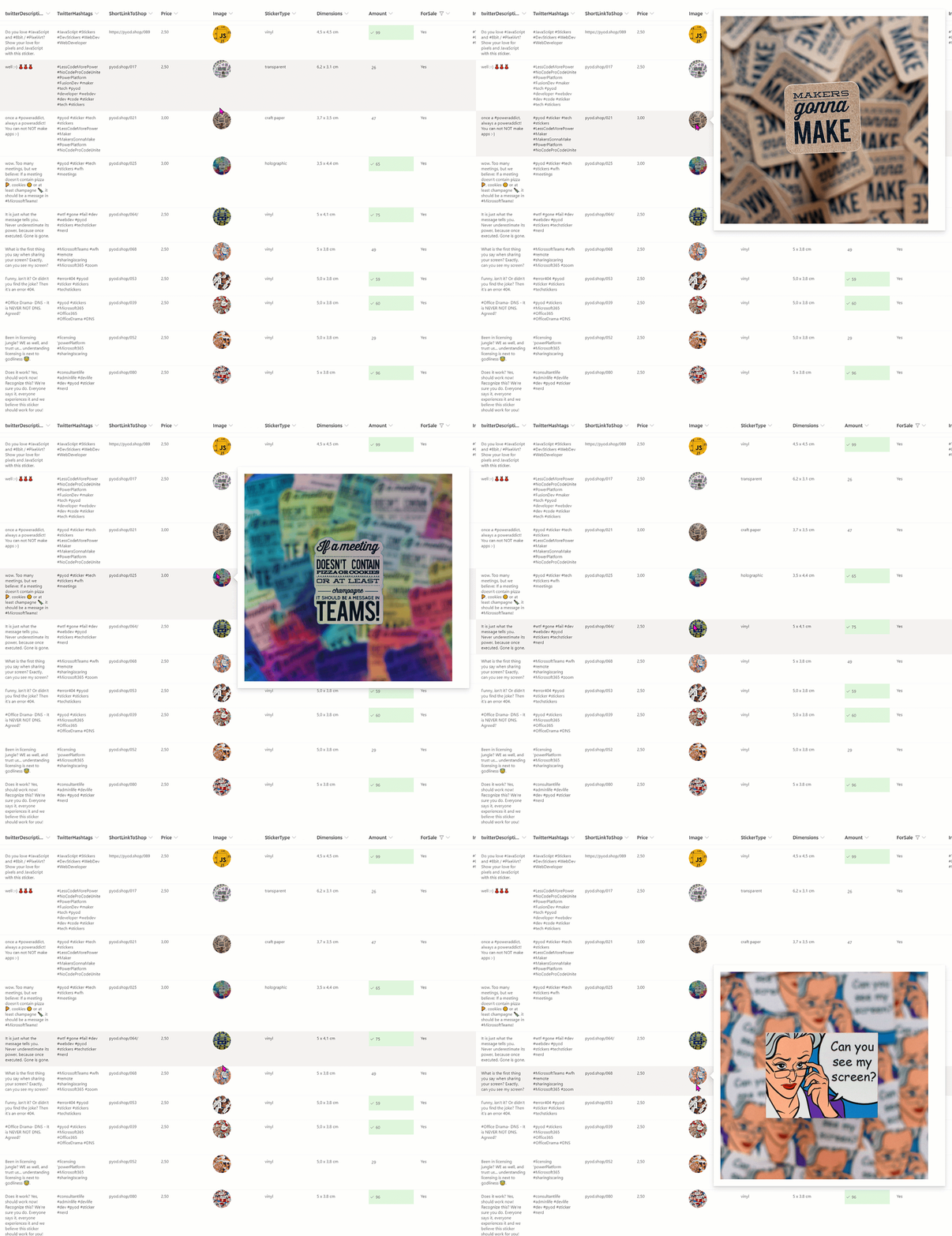
One more example how amazing a list can look like? I run a the PimpYourOwnDevoce.com sticker store together with Elio Struyf and we use a SharePoint list as our inventory (Elio blogged about the whole architecture here. With this sample we can hover over our images to have a big preview:
That’s it!
We will find view samples in the same GitHub repository.
Want to learn more?
You can find helpful resources to learn more here:
- aka.ms/m365pnp
- Microsoft 365 PnP Community on TechCommunity
- Microsoft 365 PnP List formatting repository on GitHub
Have fun and happy Modern SharePoint list formatting - #SharingIsCaring ❤
PS: Did you like this post? I wrote even more about list formatting
You May Also Like
digital clutter and how we use our time
Digital Clutter and how we use our time Do you sometimes have that feeling of being busy and under pressure for the whole day (or even the entire week) and still couldn’t check off all tasks …
Templatize a Collaboration Contract workshop and provision teams that organizations will love
## intro In my day to day life as a consultant, my customers need a lot of guidance on HOW to work with Microsoft Teams. After I educated them in what is Teams and everything in Microsoft 365 is …
How to deploy Microsoft Teams app templates in your tenant
This blog post shall guide you through the process of App deployments with Microsoft Teams App templates. Microsoft Teams is an excellent hub for collaboration, and the most fantastic thing about it …
