How to enhance maker experience with a custom theme for Teams apps
tl;dr
Creating beautiful UI in Power Apps canvas apps is hard - even more when the app shall run in the context of Microsoft Teams, as there is no theme out-of-the-box that matches Teams look and feel or supports accessibility in terms of adapting to default, dark, and high-contrast mode.
Design
When building UI in canvas apps, we have some options to apply a certain design to our app. If we want to build an app that runs in Teams, we should aim for a Teams native looks & feel. Let me explain, the good, bad an ugly :-)
The ugly
Unimaginable, but still the very ugly truth: People live with the default styles or only apply minimal styling to any controls. Their apps then look like this:
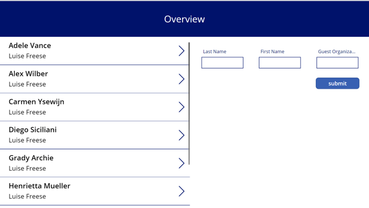
Now this is not just about my personal taste, but very obviously, this app neither matches the Teams Design, nor is it inclusive and accessible to all people, as it lacks of default, dark and high-contrast mode.
The bad
We can style each and every single button, text label, input, dropdown etc. to match our design requirements. This will often result in styling one of each correctly and then copy-paste them. It is a tedious task and very often makers tend to try to shortcut this task which then results in poor DevX and inconsistent UI.
The Good
Of course, there are better options. The default style of all controls is determined by the themes.json file that we can find in the unpacked .msapp file of the app. We can unpack the .msapp with Power Platform CLI, then manipulate the file by changing values for all the properties that we want to change and then re- pack the source code files so that they make up an .msapp again.
By applying all the Teams-appropriate colors, shapes, sizes, fonts, we can achieve an almost-native look and feel just with the (new) default controls.
The Better
However, you will have stumbled upon the almost :-) To match the Teams look, some controls need styling that can neither be applied by manipulating themes.json nor be achieved in Power Apps Studio. Let me give you two examples:
Example: Input field
For an input field, we need a border only at the bottom of the control, for which we don’t have a property in Power Apps Studio, nor in the themes.json.
Example: Calendar control
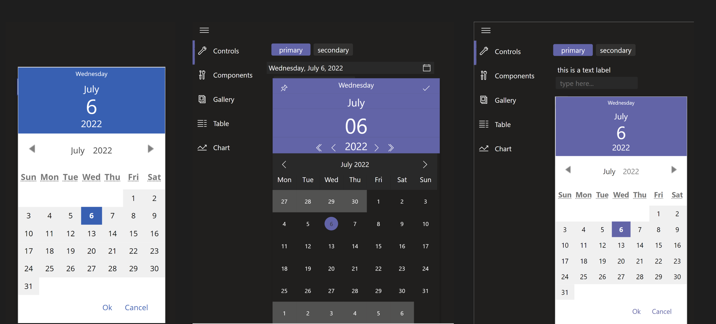
Even with manipulated values in themes.json, the calendar pop-up of the datepicker control doesn’t fully match Teams’ design when we apply dark mode or high contrast - which means that this is design-inconsistent and not accessible.
To illustrate this: On the left is the default calendar, the fill color of the header can not be styled within Power Apps studio. In the middle is the calendar already styled with the properties that we can find in theme.json, however, the background fill color can’t be changed. On the right is the custom canvas component, that nicely adapts to all three Teams themes.
Even if we do not need these particular controls, usually we can only see very basic UI in PowerApps, which is a big contrast to the advanced and slick UI of Microsoft Teams. Ever saw such a carousel in a Power App?
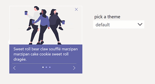
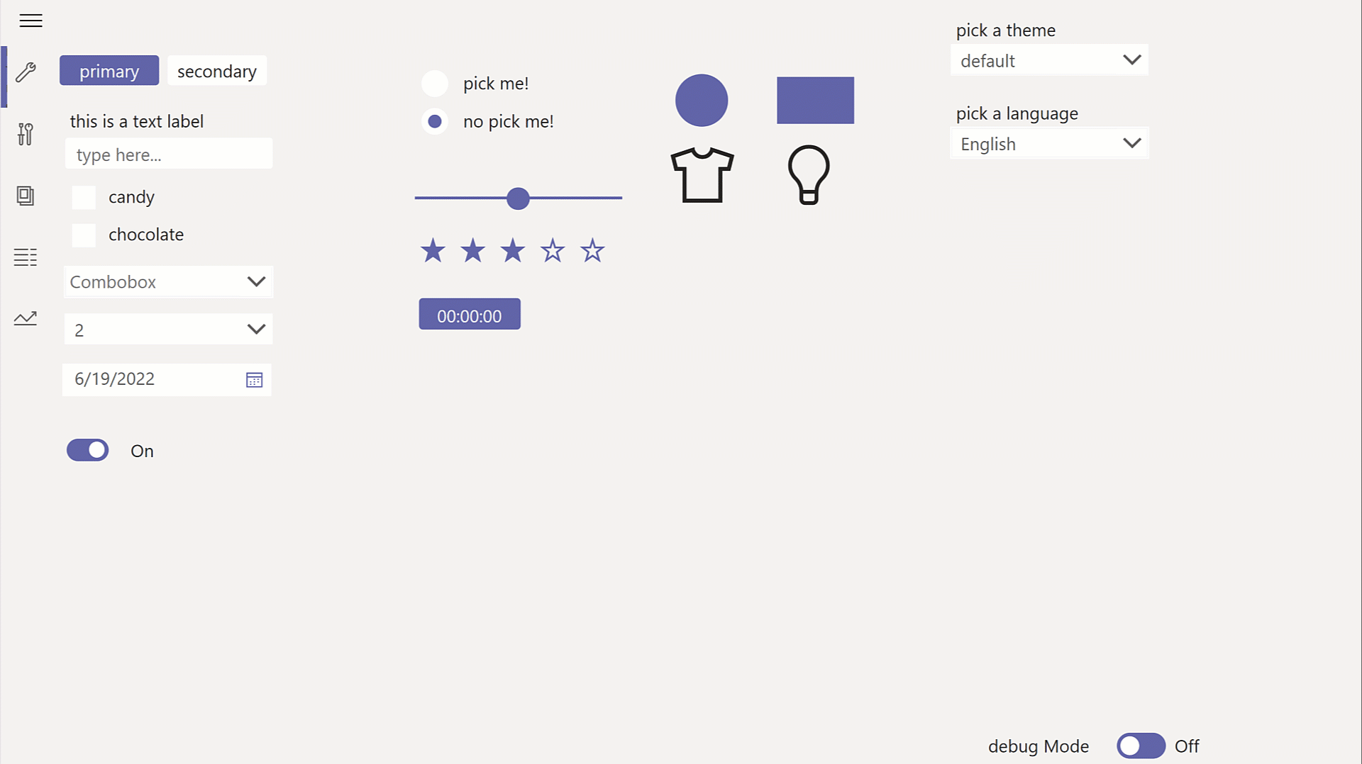
Solution: Teams theme & reference app and 10 components
To tackle this, I did not only create a Teams-design-matching themes.json for you, but also a reference app, that allows you to switch between default, dark, and high-contrast mode and also 10 canvas components for regular controls like input field or dropdown menu but also for more advanced UI snippets like the carousel component (as shown above), the calendar component, and more.
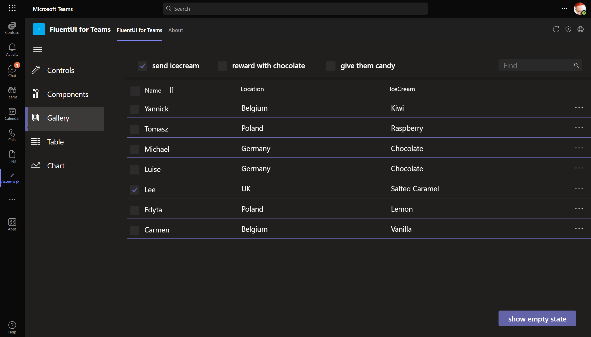
All components adapt to default, dark, and high-contrast mode and are also used in example screens that serve as inspiration how a Teams app can look like. You can find this in the PowerApps-samples repo on GitHub.
But aren’t there OOTB alternatives?
Power Apps Studio knows the concept of themes like PowerPoint does - but apparently no one thought about implementing a Teams theme into Power Apps studio directly so that this goodness is available to all makers just via UI.
Microsoft’s recently released Creator Kit for makers doesn’t offer Microsoft Teams specific Fluent UI components, but only Office specific Fluent UI components.
Within Power Apps Studio in Microsoft Teams we have access to Fluent UI controls but they neither match Office (Fluent UI) nor Teams (Fluent UI Northstar), as a button for example has no rounded corner (Office) but has a default Fill of
6264A7, which is ‘Teams blurple’. This means, that this is a very weird mix of both design approaches :-(
Feedback and what’s next?
In my opinion, a dedicated Teams theme, a component library with common UI elements and guidance how to work with it should’ve been in the product - as of day 1.
Let me know what you think on twitter.

My name is
Luise Freese
You May Also Like
How to build a color-contrast-ratio checker for improved accessibility in Power Apps
tl:dr Color contrast ratio is important for accessibility - here is how to build an in-app checker to build more accessible Power Apps What is an color-contrast-ratio checker and why would I care? …

Get insights about Power Apps usage with Microsoft Clarity PCF code component
Getting insights on user behavior in Power Apps canvas apps can be in various ways - for instance, you can analyze app telemetry with Azure Application Insights and trace events. If you are more …
How 3 makers, 2 devs and a princess came together to save kittens for a hackathon
How 3 makers, 2 devs and a princess came together to save kittens for a hackathon The Story (Michael) Just before Southcoast Summit 2021 got started, the organizers hosted the Automate Everything - …