
Stop pretending your text is bold: why fake formatting breaks accessibility
We need to talk about something that keeps showing up in LinkedIn posts, company updates, and personal branding pep talks: fancy fake bold text. You’ve seen it. You’ve maybe even used it.
𝗟𝗶𝗸𝗲 𝘁𝗵𝗶𝘀, or 𝘁𝗵𝗶𝘀, or even ⓉⒽⒾⓈ.
💡 For everyone using a screenreader: There is a line that uses unicode characters to display something that resembles bold letters. Screenreaders can’t interpret these characters.
💡 For everyone not using a screenreader: Try CTRL + Shift + U in your browser, ot should enable the Read aloud feature for some aha effect
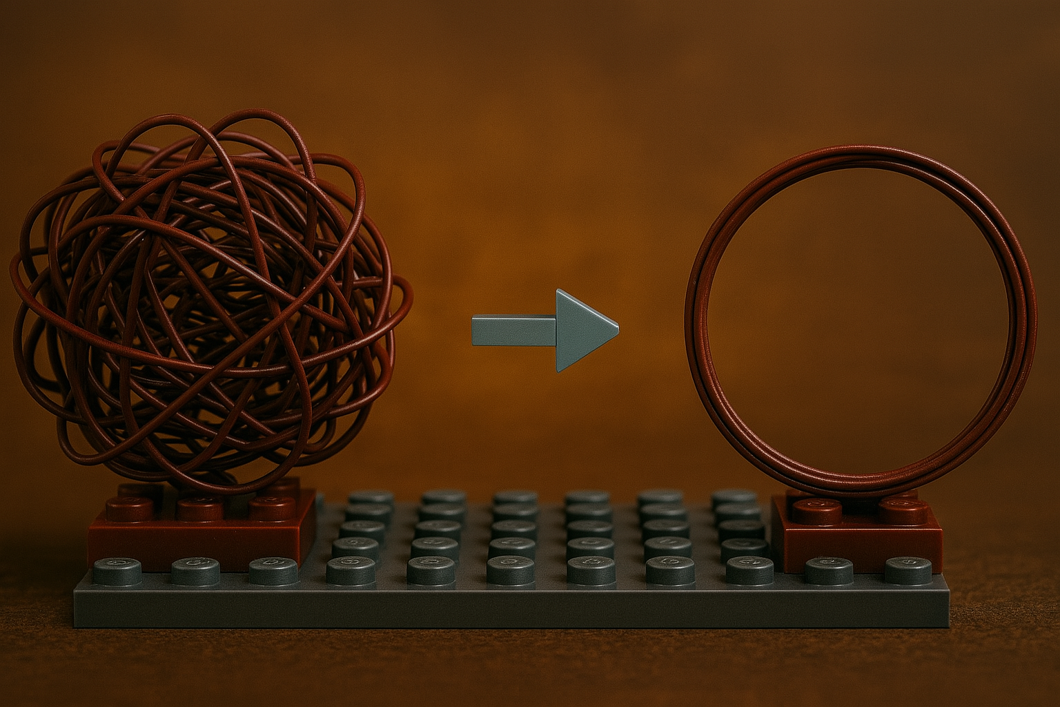
It looks cool, sure. It grabs attention. But it’s also a nightmare for screen readers, completely unsearchable, and let’s be honest: it’s a trick. A formatting hack. And the people using it usually know exactly what they’re doing.
What’s the trick?
LinkedIn doesn’t support bold text, italic, or even basic markdown formatting. So people turn to Unicode font generators: little tools that replace your normal letters with characters from obscure parts of the Unicode table that look bold, italic, or fancy. And yes, it makes the post stand out visually in the feed. That’s the whole point. But it comes at a cost.
It’s not formatting — it’s a lie.
When you type 𝐁𝐨𝐥𝐝, you haven’t added formatting. You’ve swapped normal, readable letters for mathematical symbols. To a screen reader, that’s not “bold”. That’s:
“Mathematical Bold Capital B” Or worse: nothing at all. People who rely on assistive tech won’t hear your clever headline. They won’t get your message. Because your entire paragraph just vanished into something they can’t read or understand. And it gets worse…
And no, it’s not searchable either
This trick also breaks basic functionality like search and indexing. If you write 𝐩𝐫𝐨𝐝𝐮𝐜𝐭𝐢𝐯𝐢𝐭𝐲 with fake bold letters, nobody searching for “productivity” will find it. It won’t show up in: LinkedIn search, sometime snot even in browser text search (CTRL+F), SEO indexing and translation tools. It looks like content. But it’s actually just noise. So yes, it’s a trick. And using it to game the feed while leaving part of your audience behind? That’s not clever. That’s unethical. Screen readers don’t see your branding tricks — they parse your intent. If it only works for sighted users, it doesn’t really work. Using formatting hacks to game the feed is tempting, especially when real formatting tools aren’t available. But building attention on the back of accessibility gaps is a dirty move.
Your content should be visible, readable, searchable, understandable. For everyone. If it’s only beautiful to people who can see and ignore the technical glitches, you’ve missed the point.
The real flex? Writing that works for everyone
Using fake formatting to stand out is like putting neon stickers on a car that doesn’t run. It looks good parked. It fails the second someone tries to interact with it. Real professionals know how to write clearly, structure simply, and communicate accessibly. So before you paste in that shiny Unicode headline …Ask yourself:
Am I being clever, or just unreadable?
Spoiler: the best posts are both stylish and searchable.

My name is
Luise Freese
You May Also Like
Copilot Studio: Part 1 – when automation bites back – autonomy ≠ chaos
Most organizations fear agent autonomy; not because the system is too smart, but because no one’s defined what happens when it’s wrong. This post explores how to design autonomy with clarity, …

Copilot Studio: Part 0 – everything is an agent, until it isn't
In this post, we separate real agents from glorified scripts. Copilot Studio isn’t just another automation tool; it’s how organizations delegate intent and operationalize decisions. But if you treat …

Software development is a decathlon (and low-code only gives you running shoes for two events)
Low-code platforms like Power Apps simplify parts of software development, but they don’t eliminate core engineering disciplines. Real solutions require much more: problem solving, testing, …