
Microsoft Graph toolkit people-picker lookalike for Power Apps
tl:dr
Microsoft Graph toolkit is a collection of reusable components for accessing and working with Microsoft Graph API - However, we can’t use them in Power Apps, which is why I started to build a Microsoft Graph toolkit (MGT) lookalike component library for Power Apps. The people-picker component looks like this in action:
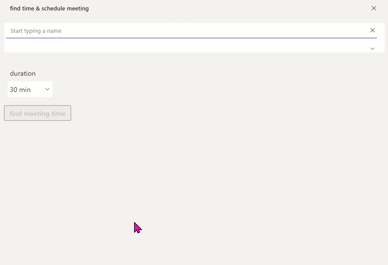
People-Picker
The MGT people picker is one of the most powerful components - it connects directly to your Azure Active Directory and shows your co-workers, which you can then select from. To make this work in a Power Apps canvas app, we need a few things:
- requires an app registration in Azure Active Directory
- makes this approach reusable
- works best as a component as you will want to re-use this
- shall adapt to different themes in Teams
Power Platform Custom Connector
Understand the /me/people endpoint
Let’s first understand what our custom connector will do. We will want to leverage the https://graph.microsoft.com/v1.0/me/people endpoint in our people picker to display people we work with - if you are unfamiliar with this, you can try out this query in Microsoft Graph explorer. To execute this, Graph Explorer needs permission for People.Read or People.Read.All.
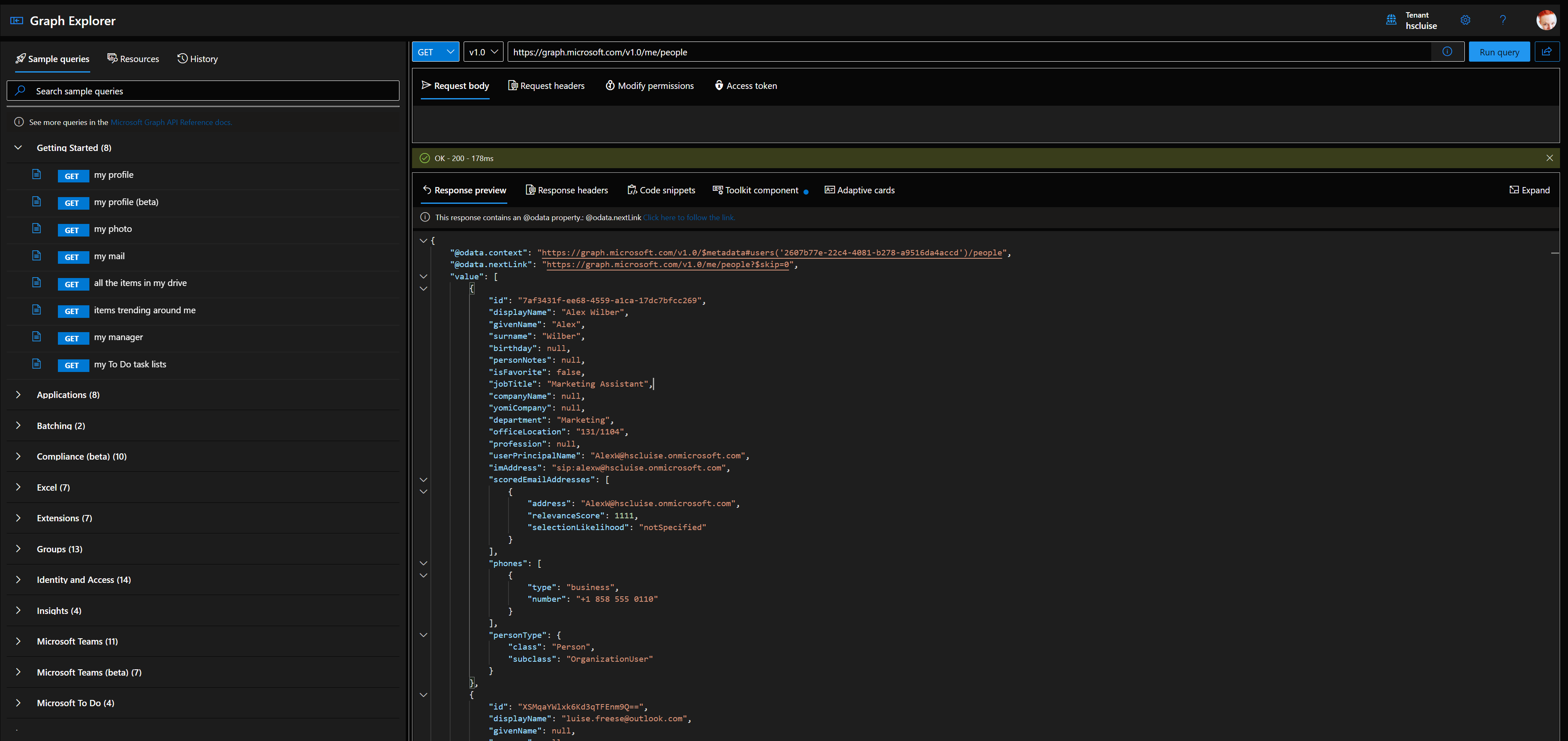
It will return an object also containing an array with users, following this schema
{
    "@odata.context": "https://graph.microsoft.com/v1.0/$metadata#users('2607b77e-22c4-4081-b278-a9516da4accd')/people",
    "@odata.nextLink": "https://graph.microsoft.com/v1.0/me/people?$skip=0",
    "value": [
        {
            "id": "7af3431f-ee68-4559-a1ca-17dc7bfcc269",
            "displayName": "Alex Wilber",
            "givenName": "Alex",
            "surname": "Wilber",
            "birthday": null,
            "personNotes": null,
            "isFavorite": false,
            "jobTitle": "Marketing Assistant",
            "companyName": null,
            "yomiCompany": null,
            "department": "Marketing",
            "officeLocation": "131/1104",
            "profession": null,
            "userPrincipalName": "AlexW@hscluise.onmicrosoft.com",
            "imAddress": "sip:alexw@hscluise.onmicrosoft.com",
            "scoredEmailAddresses": [
                {
                    "address": "AlexW@hscluise.onmicrosoft.com",
                    "relevanceScore": 1111,
                    "selectionLikelihood": "notSpecified"
                }
            ],
            "phones": [
                {
                    "type": "business",
                    "number": "+1 858 555 0110"
                }
            ],
            "personType": {
                "class": "Person",
                "subclass": "OrganizationUser"
            }
        },
        {...}
    ]
}
App registration
As our connector will need to authenticate, we will register an application in Azure Active Directory (AAD) as our identity provider. This means, that we will let AAD generate a username/password combination (client id and client secret) and equip that with permissions needed to call /me/people endpoint: People.Read or People.Read.All.
To do that, you can either
- Open portal.azure.com
- Select Azure Active Directory
- Select Add, then App registration
- Enter a name for your app - choose something like
GraphConnector-App - Select Accounts in this organizational directory only
- Select Register
- Select Overview and copy Directory (tenant) ID and Application (client) ID - we will need these later
- Select Certificates & secrets
- Select New client secret
- Select Add
- Save the value of this secret somewhere - we will need this later
- Select Permissions
- Select Microsoft Graph
- Select Delegated permissions
- Select People.Read or People.Read.All
- Select Add permissions
- Select Grant admin consent for
- Select Yes
or if you use CLI for Microsoft 365 you can register your app including permissions, granting admin consent and generating a secret with this command:
m365 aad app add --name 'GraphConnector-App' --redirectUris 'https://global.consent.azure-apim.net/redirect' --platform web --withSecret --apisDelegated 'https://graph.microsoft.com/People.Read.All' --grantAdminConsent
This will output something like this:
{
  "appId": "XXXXXXXX-XXXX-XXXX-XXXX-XXXXXXXXXXXX",
  "objectId": "XXXXXXXX-XXXX-XXXX-XXXX-XXXXXXXXXXXX",
  "tenantId": "XXXXXXXX-XXXX-XXXX-XXXX-XXXXXXXXXXXX",
  "secrets": [
    {
      "displayName": "Default",
      "value": "XXXXX~-XXXXXXXXXXXXXXXXXXXX_XXXXXXXXXXX"
    }
  ]
}
Save the value of appId and secretsomewhere.
Create the custom connector
- Open make.powerapps.com
- Select Dataverse
- Select Custom Connectors
- Select New custom connector
- Select Create from blank
- Type in a name like
GraphConnector - Select Continue
- Type in
graph.microsoft.comas Host
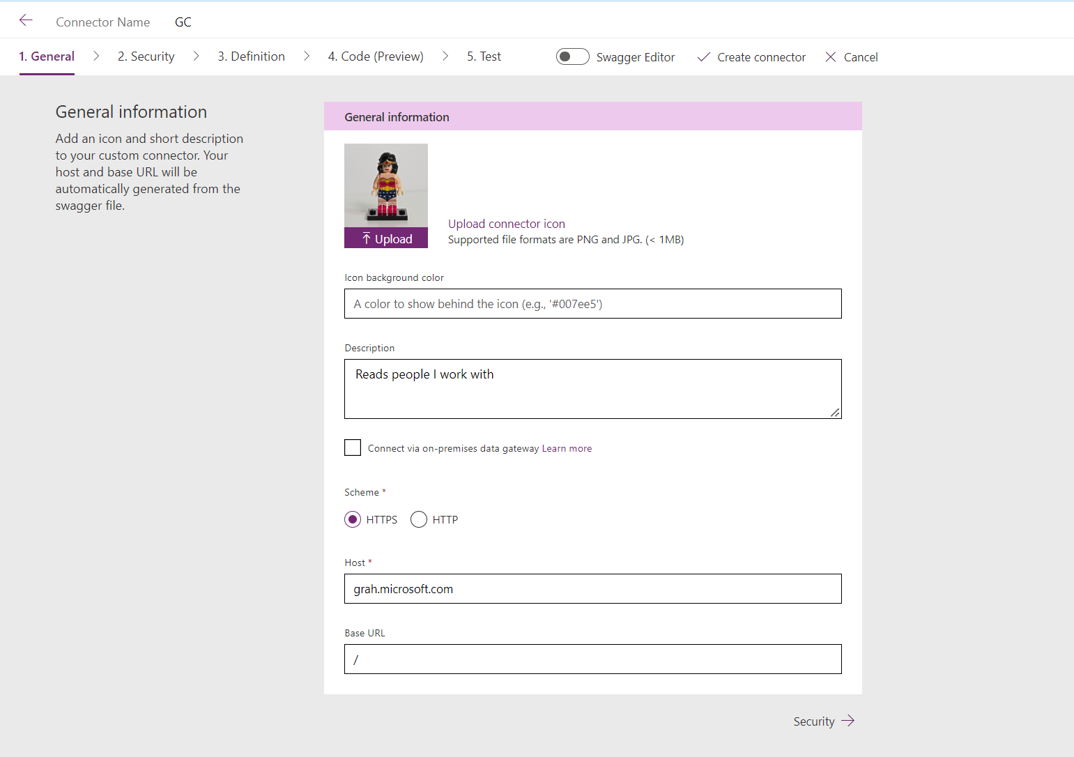
- Select Security
- Choose
OAuth 2.0as Authentication type - Choose
Azure Active Directoryas Identity Provider - Paste your
appIdfrom Azure AD app registration as Client Id - Paste your
client secretfrom Azure AD app registration as Client secret - Notice that Login URL is already set to
https://login.windows.net- don’t change - Notice that Tenant Id is set to
Common- don’t touch this - Type in
https://graph.microsoft.comas Resource URL - Notice that Enable on behalf of login is set to
false- don’t change - Type in
People.Read.Allas Scope - Select Create connector
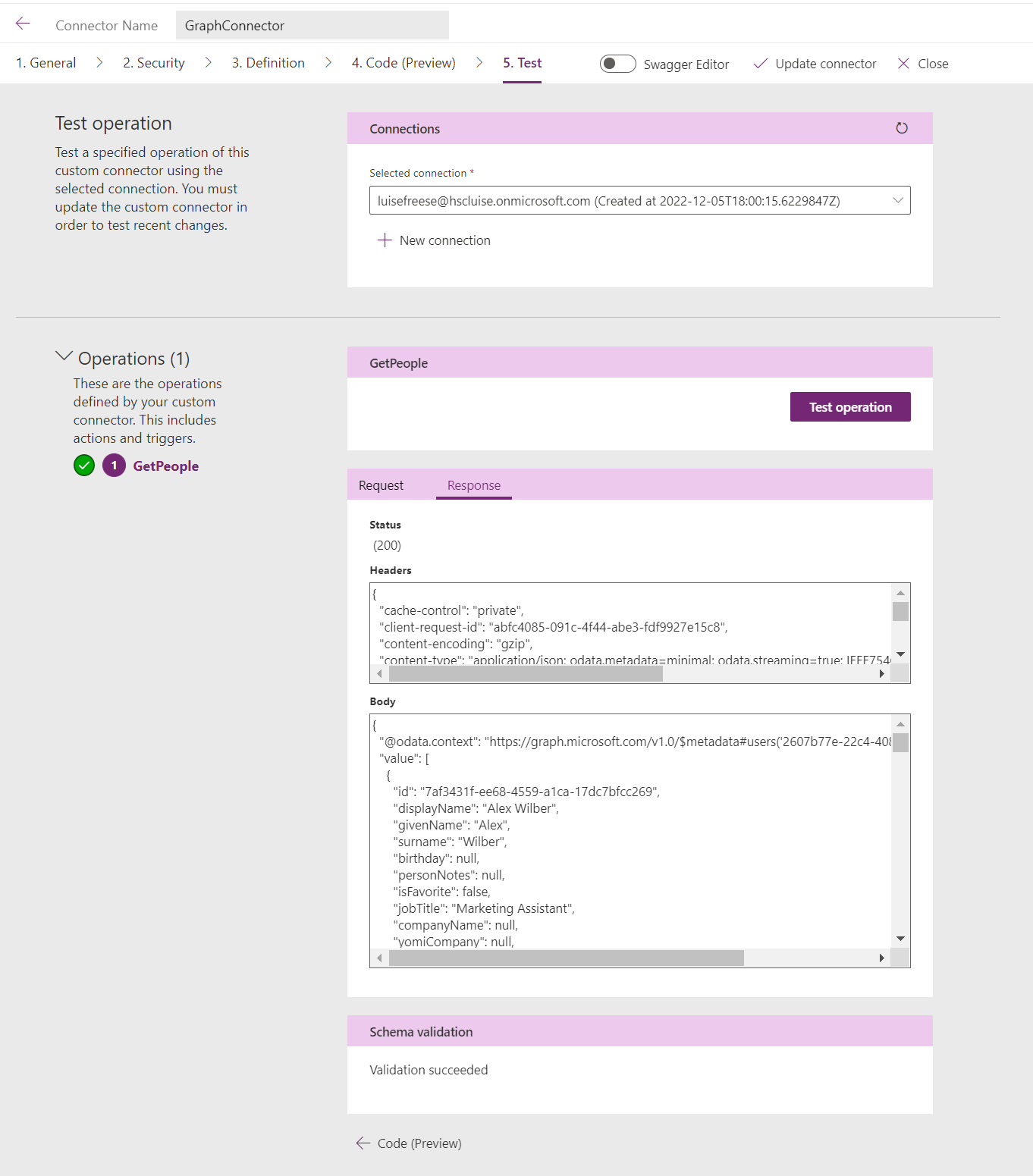
Add a GetPeople action
Now that we have a custom connector, we want to add at least one action to it.
- Select Definition
- Select New action
- Type in
GetPeopleas Summary, Description, and Operation ID - Under Request, select Import from sample
- Select
GETas Verb - Type
https://graph.microsoft.com/v1.0/me/peopleas URL (remember, it’s the same URL we used in Graph explorer) - Select Import
- Under Response, select Add default response
- Paste in the response you got from Graph Explorer in the Body field
- Select Import
- Select Update Connector
- Select Test
- Select New Connection
- Select Create - you will annoyingly be redirected to the connections overview - go back to your custom connector
- Select Test operation - you should receive a HTTP response
200 - Select Close
UI in Power Apps
Now that we have the connector working, let’s
create a Power Apps canvas app using a theme that reflects default, dark, high-contrast mode in Microsoft Teams
create a reusable canvas component as the people-picker
For all lovers of dark-mode: here is a little motivation to keep reading this post. This is what the people-picker will look like in dark mode in Microsoft Teams:
Create an app
- Create a new app
- Save it locally
- Unpackage the app via Power Platform CLI
- Select the
themes.jsonfile - Replace its content by FluentUI for Teams theme
- Package the app again via Power Platform CLI
- Open the app from within Power Apps Studio
- Add a Dropdown control
drp_theme - Set its Items property to
["default", "dark", "high-contrast"] - Set the OnChange of the dropdown and the OnStart property of the App to the content of this file
Now you have an app that reflects the 3 themes of Microsoft Teams. It will automatically adjust to the theme that is used in the Teams client. For development and test purposes, you can use the dropdown to switch to another theme.
Add the custom connector
Now add the custom connector on the Data tab to your app. Once you did that, select the OnVisible of a screen and create a collection that contains people you work with:
ClearCollect(
    colPeople,
    Filter('GraphConnector'.GetPeople().value, personType.subclass = "OrganizationUser")
);
Add the Office 365 Users connector
Add this built-in connector to easily retrieve Profile pictures of people
Create a canvas component
- Create a new component
cmp_MGT_PeoplePicker - Enable Access app scope
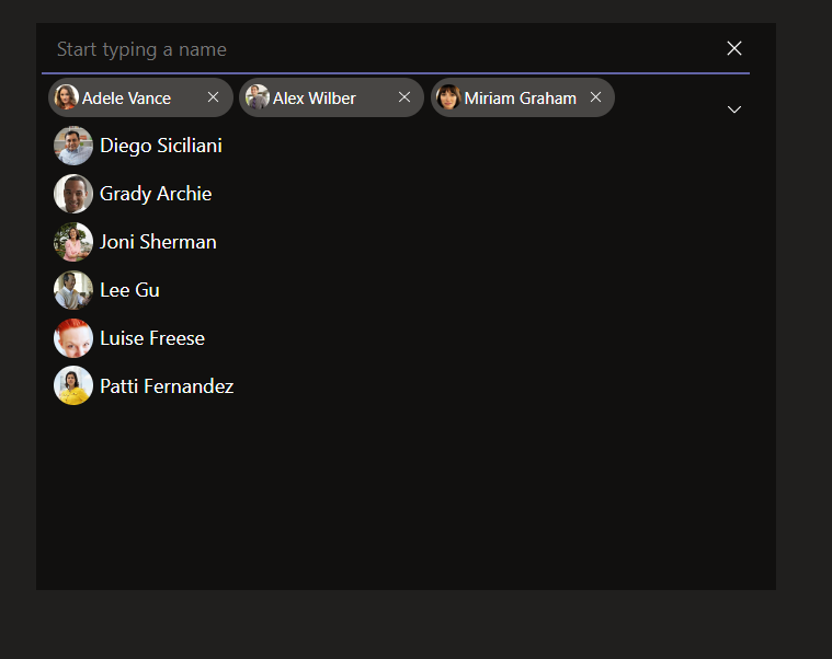
Let’s now understand what the people-picker is built:
- We will deal with two collections:
- colPeople - which contains the people our custom connector returns
- colAttendees - which contains only people that a user selected from the colPeople
- Both collections will be reflected in two galleries - gal_People and gal_Attendees
- Both collections work exclusively, this means, that a user, who is in colPeople, can’t be in colAttendees and the other way around, as it wouldn’t make any sense to select a person twice
- A textinput control allows a user to type in a name they want to add
- A Chevron down icon allows a user to expand the entire colPeople
- A X icon allows a user to delete all items from the colAttendees collection
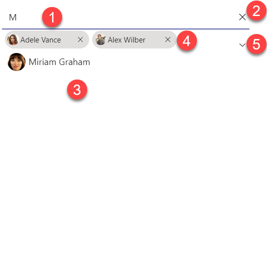
- 1 - textinput which filters the galPeople
- 2 - x icon which resets the textinput
- 3 - gal_People
- 4 - gal_Attendees
- 5 - Chevron down to expand/collapse gal_People
Textinput
- Add a TextInput
txt_input - Set it’s HintText to
"Start typing a name" - Set its Default to
"" - Set its OnSelect to
If(IsEmpty(Self.Text), Set(isGallery, false), Set(isGallery, true)) - Take care of colors:
- BorderColor:
gblAppStyles.TextInput.BorderColor, - Color:
gblAppStyles.Label.Color - Fill:
gblAppStyles.TextInput.Fill, - FocusedBorderColor:
Self.BorderColor, - HoverBorderColor:
gblAppStyles.TextInput.BorderColor, - HoverColor:
gblAppStyles.Label.Color, - HoverFill:
Self.Fill, - PressedColor:
Self.Color - PressedFill:
Self.Fill
Rectangle
we will now add a rectangle below the textinput to create that Teams look & feel
- Fill:
gblAppStyles.ButtonPrimary.BorderColor - Height:
2 - Width:
txt_input.Width - X:
txt_input.X - Y:
txt_input.Y+ txt_input.Height
gal_people
- Create a blank vertical gallery
- Set its Items to
Sort(Filter(colPeople,StartsWith(displayName, txt_input.Text )),displayName, Ascending) - Set Height to
CountRows(colPeople)*(Self.TemplateHeight+ Self.TemplatePadding) - Set Width to
txt_input.Width-txt_input.X*2 - Set Visible to
isGallery - Add an image to the gallery
- Set
- X to
10 - Y:
(Parent.TemplateHeight / 2) - (Self.Height / 2) - Width and Height:
32 - Image to
If(!IsBlank(ThisItem.userPrincipalName),Office365Users.UserPhoto(ThisItem.userPrincipalName),SampleImage)
- Add a textlabel to the gallery
- Set Color to
gblAppStyles.Label.Color - Set HoverFill to
gblAppStyles.TextInput.HoverFill - Set Width to
Parent.TemplateWidthand Height toParent.TemplateHeight - Set Text to
ThisItem.displayName - Set the OnSelect to
Collect(
    colAttendees,
    {
        type: "required",
        emailAddress: {
            name: gal_people.Selected.displayName,
            address: gal_people.Selected.userPrincipalName
        }
    }
);
Remove(
    colPeople,
    ThisItem
);
Reset(txt_input)
With that, we add people from our colPeople to our colAttendees and remove them from the colPeople. We also reset the textinput.
Chevron down
- Add an image and set its Image to
"data:image/svg+xml;utf8, " & EncodeUrl(
    "
<svg width='48' height='48' viewBox='0 0 48 48' fill='" & If(
        gblThemeHiCo,
        "#ffffff",
        gblThemeDark,
        "#ffffff",
        "#252423"
    ) & "' xmlns='http://www.w3.org/2000/svg'>
<path d='M8.36612 16.1161C7.87796 16.6043 7.87796 17.3957 8.36612 17.8839L23.1161 32.6339C23.6043 33.122 24.3957 33.122 24.8839 32.6339L39.6339 17.8839C40.122 17.3957 40.122 16.6043 39.6339 16.1161C39.1457 15.628 38.3543 15.628 37.8661 16.1161L24 29.9822L10.1339 16.1161C9.64573 15.628 8.85427 15.628 8.36612 16.1161Z' />
</svg>
 "
)
This is the Fluent UI chevron down and it will now reflect the different themes.
- Set the OnSelect to
Set(isGallery, !isGallery);
If(
    CountRows(colPeople) = 0,
    ClearCollect(
        colPeople,
        Filter('GraphConnector'.GetPeople().value, personType.subclass = "OrganizationUser")
    )
);
This controls how much we see from the gallery and also refreshes the colPeople when a user expands the gallery
gal_Attendees
We need another gallery to show the selected people
- Add a blank vertical gallery
- Set
- X:
5 - Y:
txt_input.Y+ txt_input.Height - Items:
If(isGallery,FirstN(colAttendees,6),FirstN(colAttendees,3)) - WrapCount:
If(isGallery,If(CountRows(colAttendees)<4,1,2),1) - Height:
If(isGallery,If(CountRows(colAttendees)<4,txt_input.Height*1,If(CountRows(colAttendees)<6,txt_input.Height*2),txt_input.Height*2),40)
This makes sure, that we wrap items dynamically and adjust the Height of the gallery depending on how many items are selected. This still leaves a little problem - as there is not a lot of space where we can display all people in the gal_Attendees and we already limited this to either showing 3 (when collapsed) or 6 (when expanded), we should indicate, that there are more people added.
The ‘more’ pill
- Outside of the gallery, add a new button
btn_plus
- X:
3*(gal_attendees.TemplateWidth)+10 - Y:
gal_attendees.Y + (gal_attendees.TemplateHeight-Self.Height)/2 - Width:
40and Height:32 - Text:
"+" &If(isGallery, CountRows(colAttendees)-6, CountRows(colAttendees)-3) - DisplayMode:
View - Radius:
1000 - Visible
If(isGallery,CountRows(colAttendees)>6,CountRows(colAttendees)>3)
By that, we display this button only if we have more than 3 (collapsed) or more than 6 (expanded) and show the number of items in the collection (minus the items that are already shown)
Now let’s fill the gallery with people we selected from the colPeople:
- Add a button
btn_pill
- Set its Displaymode to
View - Fill:
gblAppStyles.TextInput.HoverFill - Width:
150and Height:32 - Radius:
1000
- Add an image
img_profilePic
- Set Image to
If(!IsBlank(ThisItem.emailAddress.address),Office365Users.UserPhotoV2(ThisItem.emailAddress.address),SampleImage) - X:
btn_pill.X + 5, and Y:btn_pill.Y + (btn_pill.Height - Self.Height)/2 - Width:
20, and Height:20 - Visible:
CountRows(colAttendees) >0
- Add a textlabel
lbl_displayName
- Set Text:
ThisItem.emailAddress.name - X:
img_profilePicture.X + img_profilePic.Width - Width:
btn_pill.Width - img_profilePicture.Width - icn_close.Width-20and Height:20 - Set: Visible:
CountRows(colAttendees) >0
- Add an icon
icn_close
- X:
btn_pill.X + btn_pill.Width-Self.Width-10and Y:btn_pill.Y + (btn_pill.Height - Self.Height)/2 - Width and Height:
12 - Onselect
Remove(colAttendees,ThisItem);Collect(colPeople,{userPrincipalName:ThisItem.emailAddress.address,displayName:ThisItem.emailAddress.name})
With this we allow users to remove a person from the colAttendees and add them again to the colPeople.
The X icon
Now let’s add an X icon icon_removeAttendees so that a user can remove all people at once from the colAttendees and start all over again
- OnSelect:
Clear(colAttendees);ClearCollect(colPeople,'ProductivityHub-Connector'.GetMyPeople().value);Reset(txt_input) - X:
gal_attendees.X +gal_attendees.Width-20 - Y:
txt_input.Y+ (txt_input.Height - Self.Height)/2 - Height and Width:
16
Some more context
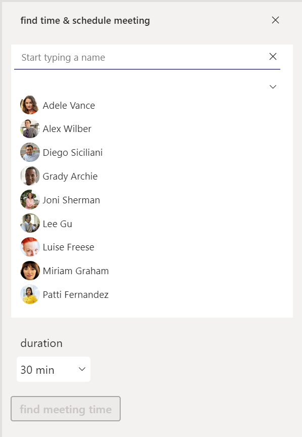
This component is part of an app - here is the real world use case: Finding meeting times for multiple colleagues.
This app is inspired by Waldek Mastykarz who created a similar app with Microsoft Graph toolkit. You can find his blogpost here.
Get the people-picker
You followed through but would just love to get this component? Don’t fret, I got you covered. Its the first component of an entire library (so this will be updated) and you get it here on GitHub
Please follow the steps under Create an app so that you get the themes working in your app.
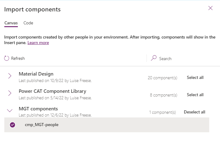
Import the component
- Import the component library into your environment
- In your app, select the
+icon on the left bar - Select
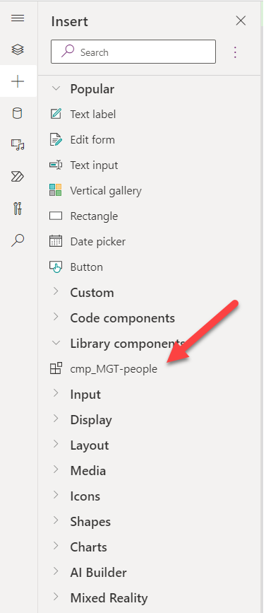
get more components - Choose the MGT components
- Select cmp_MGT_pp
- Select Import
Add the component to your app
- Select the
+icon on the left bar - Expand the section Library components
- Select the cmp_MGT_pp
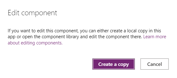
This adds the component to the screen - but it looks ugly and full of bugs - let’s fix the colors
- Right-click on the component
- Select Edit component - you will be prompted with a dialogue that you need to create a local copy -
- Select Create a copy
- Select Components on the left menu
- Select your new component
- Switch the Access app scope toggle to off and then to on again (yes, I know 🙄)
- Select Screens on the left menu
- Select
+icon onm the left bar - ⚠️ Resist the urge to expand the Library components section - remember? We created a copy, which sits right in our app 💡
- Expand Custom - you will find your copy there
- Select it - it will be added to your screen
- Either expand/collapse the galPeople by clicking on the Chevron or navigate from the screen and to it again so that the galPeople gets populated with the colPeople`
Feedback & What’s next
What do you think? Is this people-picker helpful? Which other Microsoft Graph toolkit component shall I rebuild next? Let me on on twitter

My name is
Luise Freese
You May Also Like

How to build a Power Apps progress bar component
tl;dr Components are reusable building blocks in Power Apps which increase maker productivity and design consistency. If you are new to them, you should definitely start to learn how to build them - …

How to enhance maker experience with a custom theme for Teams apps
tl;dr Creating beautiful UI in Power Apps canvas apps is hard - even more when the app shall run in the context of Microsoft Teams, as there is no theme out-of-the-box that matches Teams look and feel …

How to build a color-contrast-ratio checker for improved accessibility in Power Apps
tl:dr Color contrast ratio is important for accessibility - here is how to build an in-app checker to build more accessible Power Apps What is an color-contrast-ratio checker and why would I care? …