
Series: Build Power Apps that don't look like Power Apps - Material Design part 1
One of my most important goals when developing Power Apps is good design. But for me,
Design is not just pretty looks or some stunning effects, but it is how things work.
This means that a well designed app makes people feel related, understood, comfortable and easily experienced. People will want to use the app again and again.
Looking at the typical look of Power Apps, I don’t feel that these are well-designed in term of increasing usability, being visually appealing, or blending into the context they probably live in. This highly functional look shall convey the message, that people will get something working without putting too much effort into it. And that then leads to that perception, that low-code equals low standards in terms of design.
This is the first part of a little series that illustrates, how we can develop Power Apps, that don’t look like Power Apps. I will use Google’s Material design system to showcase this. If you are looking into some Microsoft Fluent UI guidance - I blogged about good looking apps for Teams here.
Floating Action Button (FAB)
The Floating Action Button (FAB) is a design concept, that we can find in all kinds of mobile apps, for example Twitter mobile app, Outlook mobile app, and mny, many more. We say its floating, as it doesn’t sit in a dedicated navigation area, but floats right on top of most probably scrolling content. Once that FAB is selected, it show some more related buttons that allows users to perform related actions.
How to build a FAB in Power Apps
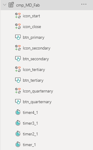
To make this FAB as flexible and reusable as possible, we will create a canvas component cmp_MD_Fab. Set its Width to 100 and its Height to 380. Our Fab will consist of
Overview
- 1 button
btn_primarywith two iconsicon_startandicon_close - 3
btn_secondary,btn_tertiary,btn_quarternarywith 3 corresponding iconsicon_secondary,icon_tertiary,icon_quarternary - 4 timers
timer1,timer2,timer3,timer4
Add these to your component - we will style them in a few.
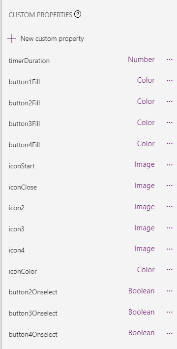
Custom properties
We will create the following custom properties
- timerDuration (Number), defaults to
300, determines the Duration of all timers - button1Fill (Color), defaults to
Black, determines Fill ofbtn_primary - button2Fill (Color), defaults to
ColorValue("#4F1FDC"), determines Fill ofbtn_secondary - button3Fill (Color), defaults to
ColorValue("#9964f4"), determines Fill ofbtn_tertiary - button4Fill (Color), defaults to
ColorValue("#BB8cF4"), determines Fill ofbtn_quarternary - iconStart (Image), defaults to
Icon.Add, determines the Icon oficon_Start - iconClose (Image), defaults to
Icon.Cancel, determines the Icon oficon_Close - icon2 (Image), defaults to
Icon.People, determines the Icon oficon_secondary - icon3 (Image), defaults to
Icon.Bookmark, determines the Icon oficon_tertiary - icon4 (Image), defaults to
Icon.Crop, determines the Icon oficon_quarternary - iconColor (Color), defaults to
White, determines the Color of all icons - button2OnSelect (Behavior, boolean), defaults to
true, determines the OnSelect ofbtn_secondary - button3OnSelect (Behavior, boolean), defaults to
true, determines the OnSelect ofbtn_tertiary - button4OnSelect (Behavior, boolean), defaults to
true, determines the OnSelect ofbtn_quarternary
and assign them as stated above. Example: Select all timers, select the Duration property for them, set it to cmp_MD_FAB.timerDuration. Proceed with all other custom properties like that.
The buttons
We will now take care of the buttons. Select all of them and set their
- Width to
56, Height toSelf.WidthandRadiustoSelf.Width. - We now have circle buttons! - BorderColor, HoverBorderColor, PressedBorderColor, HoverFill to
Self.Fill - Text to
""
Now only select the btn_primary and set its X to (Parent.Width-Self.Width)/2 and its Y to Parent.Height-Self.Height-10. After that is done, select all other buttons and set their X to btn_primary.X.
The Icons
Set Width of all icons to 32 and Height to Self.Width
Set X of all icons to btn_primary.X+ (btn_primary.Width-Self.Width)/2
Set Y of btn_secondary to btn_secondary.Y+ (btn_secondary.Height-Self.Height)/2
Set Y of btn_tertiary to btn_tertiary.Y+ (btn_tertiary.Height-Self.Height)/2
Set Y of btn_quarternary to btn_quarternary.Y+ (btn_quarternary.Height-Self.Height)/2
Make sure that all controls sit in the correct order as they overlap:
The Timers
Now we will take care of the logic.
- In the OnSelect of the
icon_Startwe want to extract all buttons and handle which icon appears :Set(start1, true); Set(start4, false); Set(isCloseVisible, true); Set(isStartVisible, false); - In the OnSelect of
icon_Closewe want to collapse all buttons and handle which icon appears:Set(isCloseVisible, false); Set(isStartVisible, true); Set(start1, false); Set(start2, false); Set(start3, false); Set(start4, true); - Set the Visible of
icon_ClosetoisCloseVisible, the Visible oficon_StarttoisStartVisible - Set the Start of
timer1tostart1, and theOnTimerEndoftimer1toSet(start2, true)- which means that at the end of the first timer, we kick off the second timer. - Set the Start of
timer2tostart2, and theOnTimerEndoftimer2toSet(start3, true) - Set the Start of
timer3tostart3- please note that at this point we don’t want to kick off another timer - all buttons are expanded and we only want to collapse them when our user selects theicon_Close.
Let’s now hook the Y property of btn_secondary, btn_tertiary, btn_quarternary to the timers so that the buttons nicely float to their final position:
- Set the Y of
btn_secondarytoIf(!start4, btn_primary.Y-100*(timer1.Value/timer1.Duration),btn_primary.Y) - Set the Y of
btn_tertiarytoIf(!start4, btn_primary.Y-200*(timer2.Value/timer2.Duration), btn_primary.Y) - Set the Y of
btn_quarternarytoIf(!start4,btn_primary.Y-300*(timer3.Value/timer3.Duration),btn_primary.Y)
Add your component to a screen and don’t forget to now assign actions to the buttons :-)
Feedback and what’s next?
That’s it!
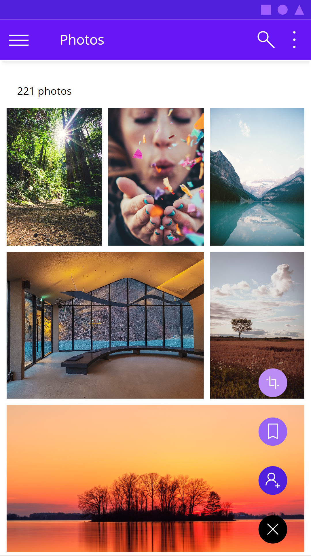
a few buttons, icons and 4 timers are enough to create some advanced UI that you’d usually not find in a Power Apps. Next blog post is about how to create such beautiful photo galleries, that don’t look like default Power Apps experience. Let me know what you think on twitter.
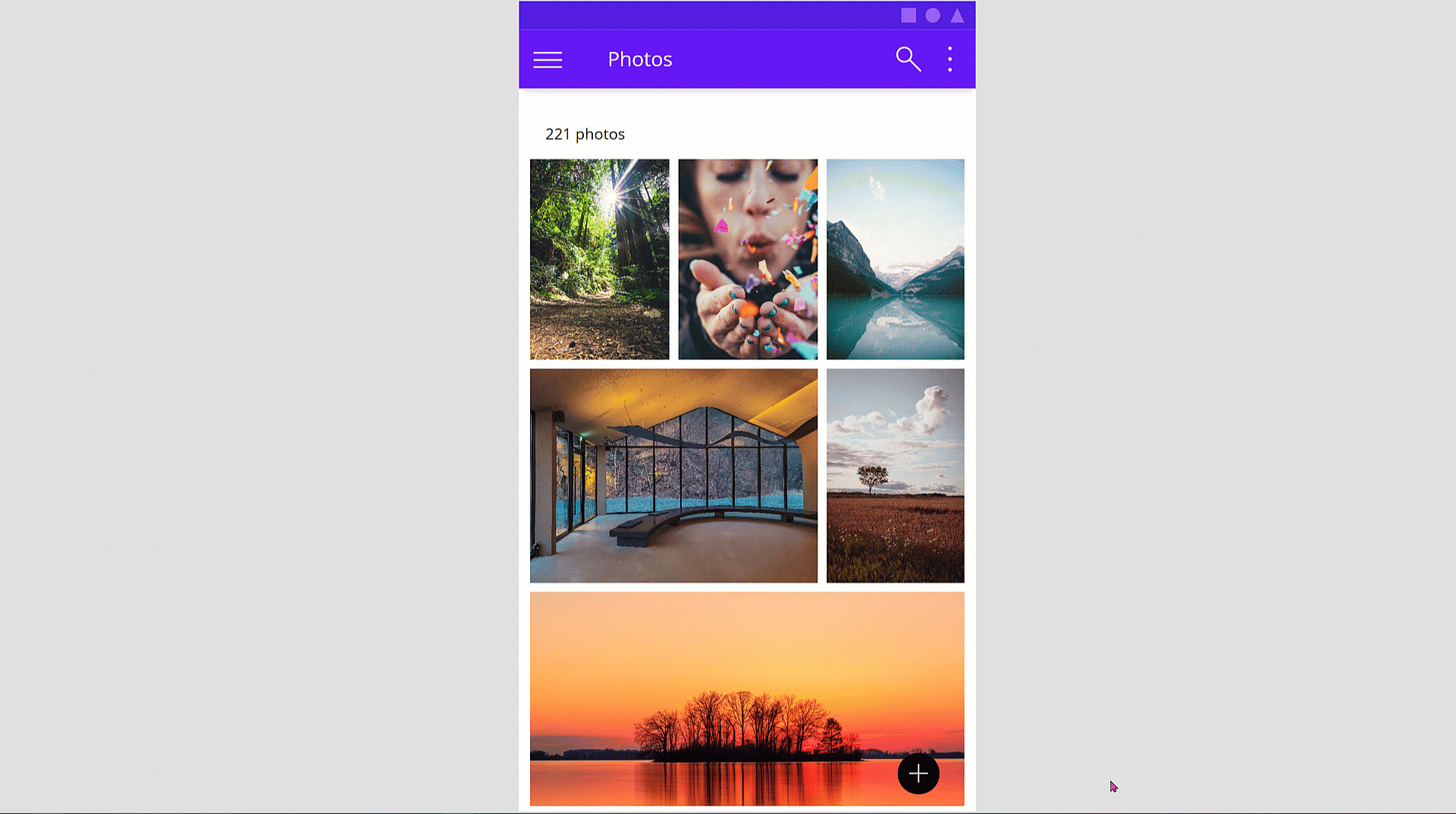
Next blog post in this series is about how you can create this cool looking gallery with with various image sizes.

My name is
Luise Freese
You May Also Like
Get started with planning your Power Apps components properly
Power Apps components are awesome, still I do not see too many organization using them, which is why I want to give some guidance on how to better plan and build components. Proper planning can save …
Build a progress button with me (yes it is a component)
tl;dr You know that feeling when right after hitting that send button you still want to edit something or changed your mind? This progress button allows people to rethink again and change their minds. …
Can you make it pop?
tl;dr Want to improve your app design and your galleries? Learn how to make your galleries pop out and get this very dynamic look and feel! There are a few things you can do to make your galleries …