
How to apply modern card design in a SharePoint list with listformatting
I wanted to explore if I could implement a nice overview card in a SharePoint list column, that would display at a glance for example customer feedback, whom this is assigned to and also display to buttons which would initiate calls, emails, etc.
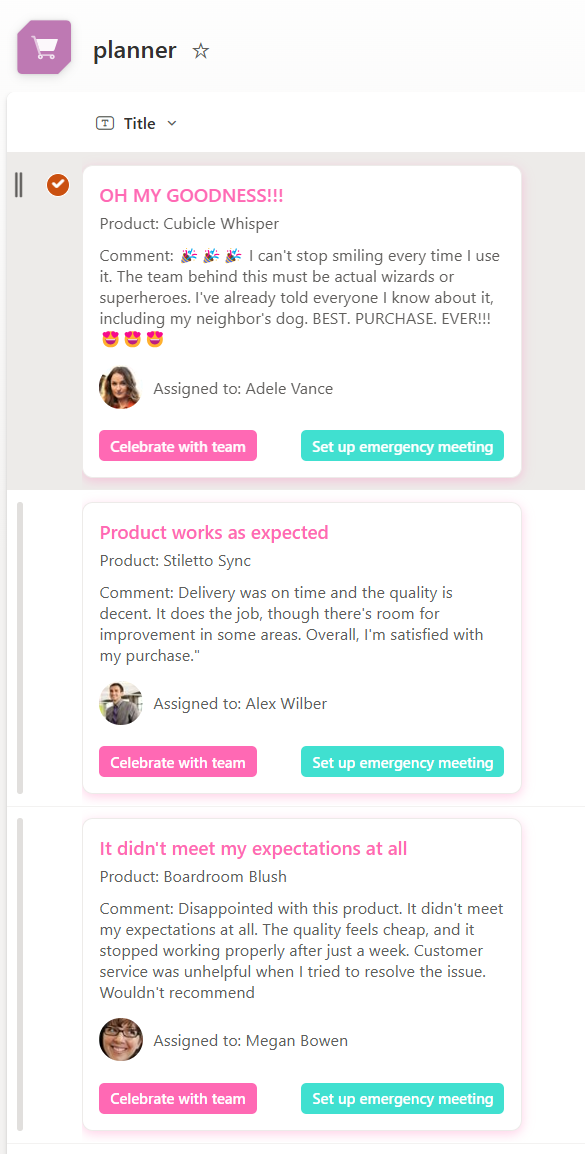
The end result looks like this:
To achieve this we will first prep our list:
- Create columns as per your liking, I chose Comment (Multiple lines of text), Assigned to (Person) and Product (Single line of text)
- Fill in a few rows that you actually see a difference once we play with code ✅
- Select the Title column > Column settings > Format this column
- Select Advanced mode
- Delete the code in the box and paste the code:
{
  "$schema": "https://developer.microsoft.com/json-schemas/sp/v2/column-formatting.schema.json",
  "elmType": "div",
  "style": {
    "box-sizing": "border-box",
    "padding": "8px 0",
    "height": "100%",
    "display": "flex",
    "align-items": "center"
  },
  "children": [
    {
      "elmType": "div",
      "style": {
        "display": "flex",
        "flex-direction": "column",
        "padding": "12px",
        "background-color": "#ffffff",
        "border": "1px solid #edebe9",
        "border-radius": "8px",
        "box-shadow": "0 2px 8px rgba(255, 105, 180, 0.3)",
        "max-width": "300px",
        "max-height": "280px",
        "overflow": "hidden"
      },
      "children": [
        {
          "elmType": "div",
          "style": {
            "font-weight": "600",
            "font-size": "14px",
            "margin-bottom": "4px",
            "color": "#ff69b4"
          },
          "txtContent": "[$Title]"
        },
        {
          "elmType": "div",
          "style": {
            "font-size": "12px",
            "margin-bottom": "8px",
            "color": "#605e5c"
          },
          "txtContent": "='Product: ' + [$Product]"
        },
        {
          "elmType": "div",
          "style": {
            "margin-bottom": "12px",
            "color": "#605e5c",
            "font-size": "12px",
            "max-height": "80px",
            "overflow": "auto"
          },
          "txtContent": "='Comment: ' + if([$Comment], [$Comment], 'No comment')"
        },
        {
          "elmType": "div",
          "style": {
            "display": "flex",
            "align-items": "center",
            "margin-bottom": "8px",
            "width": "100%"
          },
          "children": [
            {
              "elmType": "img",
              "style": {
                "width": "32px",
                "height": "32px",
                "border-radius": "50%",
                "margin-right": "8px"
              },
              "attributes": {
                "src": "=if([$Assignedto.email], '/_layouts/15/userphoto.aspx?size=S&accountname=' + [$Assignedto.email], '<URL of your fallback image>')",
                "title": "=[$Assignedto.title]"
              }
            },
            {
              "elmType": "div",
              "style": {
                "font-size": "12px",
                "color": "#605e5c"
              },
              "txtContent": "='Assigned to: ' + [$Assignedto.title]"
            }
          ]
        },
        {
          "elmType": "div",
          "style": {
            "display": "flex",
            "justify-content": "space-between",
            "margin-top": "8px"
          },
          "children": [
            {
              "elmType": "button",
              "style": {
                "padding": "4px 8px",
                "background-color": "#ff69b4",
                "color": "#ffffff",
                "border": "none",
                "border-radius": "4px",
                "cursor": "pointer",
                "margin-right": "8px",
                "font-weight": "600",
                "font-size": "11px",
                "transition": "background-color 0.2s ease",
                "white-space": "nowrap"
              },
              "attributes": {
                "class": "ms-fontWeight-semibold"
              },
              "txtContent": "Celebrate with team",
              "customRowAction": {
                "action": "executeFlow",
                "actionParams": "{\"id\": \"<flow 1 id goes in here>\"}"
              }
            },
            {
              "elmType": "button",
              "style": {
                "padding": "4px 8px",
                "background-color": "#40e0d0",
                "color": "#ffffff",
                "border": "none",
                "border-radius": "4px",
                "cursor": "pointer",
                "font-weight": "600",
                "font-size": "11px",
                "transition": "background-color 0.2s ease",
                "white-space": "nowrap"
              },
              "attributes": {
                "class": "ms-fontWeight-semibold"
              },
              "txtContent": "Set up emergency meeting",
              "customRowAction": {
                "action": "executeFlow",
                "actionParams": "{\"id\": \"<flow 2 id goes here>\"}"
              }
            }
          ]
        }
      ]
    }
  ]
}
How the magic works
This code turns a boring SharePoint list item into an elegant card with a dynamic title, product info, comments, and even the assignee’s profile picture. It’s styled to look good with borders, shadows, and action buttons that can trigger Power Automate flows, like celebrating with the team or setting up a meeting. When I showed this to someone who never did listformatting so far, they asked me to explain this very thoroughly and in detail in this blog post - so here we go:
General structure
- The parent
divis like a container that holds other elements (like text, images, or buttons) - The
styleblock applies styling to the container, like padding, height, and alignment. In this case, it ensures that the container takes up 100% of the height, aligns everything neatly in the center, and gives it some padding.
Child elements (what’s inside the card)
Now let’s look at what’s inside the card (the children array):
- Card Container: another
divinside with a border, and rounded corners to make it look like a neat card. It also has a max size and a shadow effect. Titleis styled as a bold, hot-pink (#ff69b4) title. It displays the value from the Title column of your SharePoint list(with [$Title]).Productis a text block that displays the product associated with the item. It uses a formula(="Product: " + [$Product])to prepend the word “Product” before showing the value from the Product columnComment: Here’s where the comment shows up. If there’s no comment, it will display “No comment” instead of leaving it blank. This is controlled by a simple if statement:if([$Comment], [$Comment], 'No comment').Assigned to(Profile Picture + Name): displays a profile image and name of the person assigned to the task. It shows a small circular image (profile picture), and if no picture is available, it falls back to a generic person icon. The email is used to fetch the image(/userphoto.aspx?size=S&accountname=), and it also shows the person’s name next to it.- Action buttons: At the bottom of the card, you’ve got two buttons:
- Celebrate with team: This button when clicked, it runs a Power Automate flow with an ID specified in the
actionParams. It can do something like sending an email to the team or scheduling a meeting. - Set up emergency meeting: This button triggers a different flow, maybe to create an emergency meeting or some other urgent task. Again, the flow ID is defined in
actionParams.
- Celebrate with team: This button when clicked, it runs a Power Automate flow with an ID specified in the
Let’s take action: The Power Automate flow
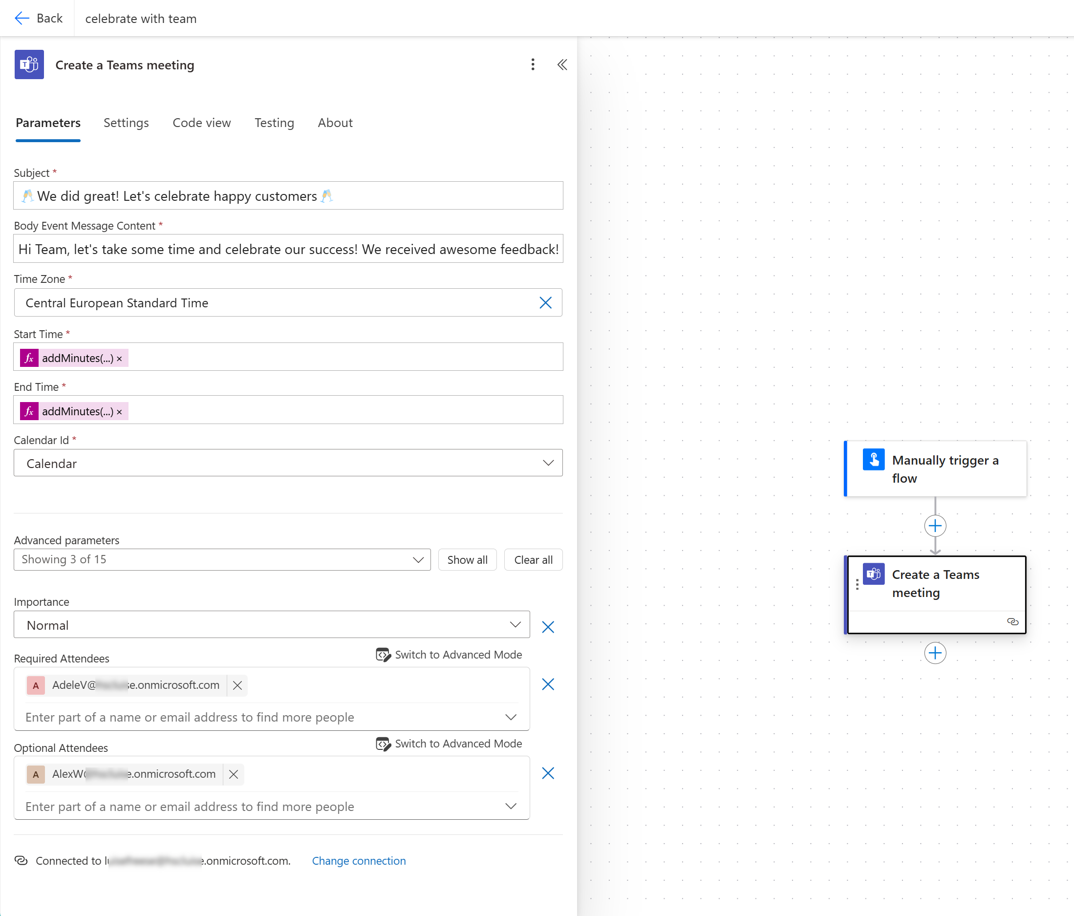
Obviously, if we want something to happen on the click of one of the buttons (I know, they really look great already without any functionality, but still 😇), we will need to trigger a Power Automate flow.
- Create a new instant cloud flow in your default environment
- Add a Create a Meeting action from the Microsoft Teams connector
- Fill in the details as per your needs
- Save the flow
- Once the flow is saved, copy the flow id from the URL. The full URL will look like this:
https://make.powerautomate.com/environments/Default-<your Azure Tenant-id>/flows/<this is your flow id>/details - Copy paste your flow ids into the json snippet - Boom - done!
A few remarks though
Mind, that my very simple flows shall just illustrate the idea to run a sequence of events on the click of a button in such an elegant card design in list. Here are a few suggestions:
- if you need context of the selected list item (and for instance get the customer name, their feedback or the assigned person from it), change the trigger to the SharePoint’s For selected item trigger
- if you try to schedule a meeting so that everyone is actually free, you can utilze Microsoft Graph API’s user: findMeetingTimes, it will need an array of users and of course a meeting duration. Once you got the slot, you can schedule the meeting easily. (Let me know if you want me to write a blog post on this.)
Conclusion
A list, 2 flows and a json snippet is all you need for this beautiful and functional card layout! What are your use cases?

My name is
Luise Freese
You May Also Like

Populate SharePoint List multiple choice column with Microsoft 365 Groups-and add some List formatting
Recently, a customer asked me if I could automagically populate Microsoft 365 Group Names to a multiple choice column in a SharePoint list. Of course I told them that one can create an ootb Person …

Resource naming reloaded: Azure Policy and Bicep for the winner!
Let’s solidify naming conventions with Azure Policy In one of my last blog posts, How to use Azure Policy to enforce resource naming conventions in your DevOps pipelines I explained how one could …

How to rotate secrets with Azure Logic Apps, Key Vault and Managed Identity
Do we REALLY need to rotate secrets? Ever wonder why we’re always harping on about rotating secrets in Microsoft Entra App Registrations? Rotating secrets is kind of like changing the locks on your …